Blindness, low vision, vision loss, and visually impaired are all terms commonly used in relation to people who cannot see well. According to the World Health Organization, approximately 1.3 billion people around the globe live with a vision impairment of some sort. To be considered legally blind, a person must have a central visual acuity of less than 20/200 in their best eye. In the United States, there are approximately 7.6 million people living with visual disability. That’s a large number of people with vision impairment who are endeavoring to navigate the world around them.
Today, those dealing with vision loss live increasingly independent lifestyles. They are out in the community, using their existing vision along with technology and assistance devices to maneuver alongside people with normal vision. For those designing and building public spaces, making those spaces easier to access and negotiate for people with vision concerns is an important consideration.
People with vision loss learn how to navigate a world designed for seeing people, and they use specific design elements, such as blistered pavers before crosswalks, to help. There are established international standards that help keep these signals and cues uniform around the globe, and designers should adhere to them as they work to create spaces that work for people with vision loss. In addition, many municipalities now require these standardized features, and in some cases, they are a national requirement under the Americans with Disabilities Act. Learning what to consider and include when designing a space can not only help you create spaces that all can use, but also will help you adhere to these important legal guidelines.
In order to design spaces that people with vision loss can navigate, you must understand how they navigate the world with limited vision. First, know that most people who are legally blind or deal with other vision conditions do have some degree of sight. They do rely partially on their sight, so some visual cues can be used. Second, people with vision loss use textures and audible signals to navigate the world, so increasing the use of these elements can help make a space easier to navigate.
Remember, vision loss is not always obvious. You will have people in your space who have vision loss but look and move just like people with normal vision. Accommodating their needs can make your space universally more inviting to all potential visitors, regardless of their ability to see well. As you plan the design for your space, remember to consider the needs of those dealing with vision loss.
This guide provides recommendations for design features for outdoor and indoor spaces, and long walkways, as well as special considerations for those who walk with canes or guide dogs, and those who have issues with colorblindness, depth perception, or scope-of-field. These recommendations can help you keep in mind the many ways you can assist those who have vision loss as they navigate your newly developed space.
Outdoor Spaces – Design Recommendations
Navigating the outdoors is a definite challenge for people who are visually impaired. Unlike their own homes, where they can control the environment, the outdoors are filled with challenges and constantly changing hazards. An overemphasis on shared spaces, roadways without clear barriers that are shared by motorists, pedestrians, and cyclists, in urban locations around the globe has increased this challenge and the risk to people with vision issues. Thankfully, modern technology and the use of canes or guide dogs make it possible for people with limited vision to maintain an active role in the community and get out to enjoy the outdoors, but those who design outdoor spaces need to strive to make it easier for them to navigate the world as well.
Increase Contrast
People with low vision often can rely on increased contrast to help them see where roadways and hazards are. Here are some areas where you can add contrast to improve the navigability of your outdoor space.
Use color contrasts to indicate a difference in function. For example, if you want to differentiate between a sidewalk and a curb, add a bright white or yellow line to the edge of the curb, which will differentiate it from the dark pavement.
Add colored contrast to the edge of steps. Someone with a visual impairment might struggle to discern the difference in depth at a stairway or step. Add a visual, high-contrast clue to the edge of the step to help.
Use illumination or lighting contrasts to help people see areas where their safety may be at risk. Augment illumination at crosswalks and similar areas for people who struggle to see well. Care should be taken to minimize glare while maximizing contrast.
Add illumination to the ground for contrast after dark. LED lights added to areas where contrasting colors are located will help those with vision impairment see the contrast even when the sun sets and the paint is no longer clearly visible.
Use contrasting textures, like bubble pavement, to indicate changes. In some areas, like crosswalks, texture changes are required to meet ADA requirements. In other areas, texture changes are simply a helpful signifier of terrain or traffic-feature changes.
Use tactile paving to indicate a change between areas designated for pedestrians, bikes, and other uses. The use of tactile paving does not need to be limited to crosswalks and bubble pavement. You can also add elongated ridges along walking paths to help people with low vision detect where they can safely walk. This can help users with vision impairments stay safe and avoid causing a hazard for those on bikes or motorbikes.

Utilize Sounds
People with vision concerns learn to rely on their other senses to navigate the world. For example, they may perceive when they’re approaching a cross street by listening for the sounds of oncoming traffic or feeling a change in the wind direction due to the lack of buildings blocking the wind. There are numerous methods of building that use sounds to capitalize on this technique and help people navigate their world.
Create spaces that minimize echoes. The sound distortion created by echoes can be difficult for people with vision concerns to manage. In certain configurations, it confuses the input on which they could otherwise rely for additional info about their surroundings.
Utilize auditory (sound) cues at important areas. Adding an alarm or countdown to an intersection that alerts a blind user when it’s safe to cross, for example, can make the crossing safer.
Consider different sounds given off by different textures when making textured surfaces. For example, when someone is walking with a long cane, rubber tiles near intersections give off a different sound than the pavement, signaling a change in terrain.
Create Barriers
In outdoor spaces, barriers are important to help individuals with vision impairment discern where they are and where the should or should not be. Use these tips to make them more easily seen and helpful.
Use fencing to indicate the boundary of shared spaces. From playgrounds to garden spaces, adding a fence will help someone with vision concerns be able to feel and distinguish the boundaries of a space.
Add contrasting colors to boundaries to make them more visible. Boundaries are helpful, but not if a vision-impaired individual trips over them. Use colors on the boundary markers that contrast with surrounding areas to make them more visible.
Utilize non-solid boundaries where fencing is not appropriate. Short poles or posts, for instance, can create a visual barrier to a space where a fence may not be appropriate or needed. These must be marked by especially high-contrast colors or markers so that vision-impaired individuals can see or reach for them to distinguish the edges of the space.
Keep boundaries low enough that a user can trail the boundary by hand. This means boundaries should be about waist high for the average adult. Too low a boundary creates a tripping hazard, and too high imposes an obstacle.
Design “Don’ts” for Shared Spaces
When designing outdoor spaces to accommodate the needs of blind individuals, keep these “don’ts” in mind:
Don’t use textures in areas where they do not make sense. Blind individuals expect certain textures, like blistered pavement at crosswalks. If they feel the blisters but do not find the crosswalk, the textured pavement is not helpful. Don’t create confusion by inserting textures to signal features that are not present.
Don’t make the walkways too curvy. Curves simply for the sake of aesthetics can be confusing or frustrating for those with vision impairment. Try to keep walkways as straight as possible.
Don’t add boundaries that could be more hazardous than helpful. Poles, rails, and fences can help blind or vision-impaired people navigate your space — but not if they’re hard to see or feel, or if they’re situated in an unexpected place that makes them dangerous. Make sure these are clearly marked with contrasting colors and are placed at logical spaces where a blind person would naturally expect to find a barrier, such as the edge of the roadway or the boundary of a community space.
For more information about designing outdoor spaces to aid the navigation of individuals with vision impairments, visit:
- World Blind Union: How Shared Spaces Affect the Safe Transit of Blind and Partially Sighted Persons
- British Journal of Visual Impairment: Accessibility of Shared Space for Those Who Are Visually Impaired
- Scottish Sensory Centre: Accessing Outdoor Environments for Visually Impaired Children
- TeachingVisuallyImpaired.com: Playground Adaptations for Students with Visual Impairments
- National Federation of the Blind: Audible Street Signals Are Barriers to the Blind
- We Capable: Meanings of Tactile Paving: A Blessing for Persons with Visual Impairment
Indoor Spaces – Design Recommendations
Contrast, textures, sounds, and lighting are equally important indoors as they are outdoors. People living with visual impairment can benefit from additional design features that help them navigate indoor spaces with ease. As a designer, you can implement these, including both the required strategies and additional ones, to make your space safer and friendlier to those with vision impairment.
Stairways
Display tactile and visual signals around stairways. Use contrasting colors or textures, and prominent boundaries and signage to make stairways more obvious to someone with vision impairment.
Use the texture of stripes at the top and bottom of the staircase. Raised stripes indicate a tripping hazard is ahead, and blind individuals know to watch for this texture when navigating a space. The stripes should run parallel to the step to help orient someone approaching or walking in the space.
Add textured tape or another textured warning signal to the edge of each step. This can help someone going up or down stairs know when they have reached the edge of each step.
Use contrast to mark the edge of steps. In addition to the tape, use contrasting colors to mark the edge of the step. Choosing textured tape that contrasts with the step color can accomplish this.
Add railings to all staircases. Railings are required on most staircases for building code and ADA compliance, but make especially sure they’re readily accessible to people with vision concerns. Place them at a natural level and on both sides of the stairs, even if your local building codes only require them on one side.

Elevators
Install alarms or beeps in elevators to signal to people with vision issues what floor they’re passing and when they arrive. Consider building elevators that announce each floor as they pass, to help people with vision impairment get off on the floor they’ve selected. Chimes, voices, and other signals are considered part of modern ADA compliance.
Use contrasting textures and colors at the opening to an elevator. This will allow the blind people using your elevator to know when they’ve completely boarded the elevator.
Include textured or Braille markings on elevator buttons. Individuals with vision challenges can select the floor they need by reading the markings on the bank of buttons.
Or substitute keypad input for Braille. Though Braille is effective, it can be time-consuming. Most blind people have learned to use traditional keypads, which can be a more effective way to select a floor.

Doorways and Windows
Add stickers or glazing to glass windows and doors to improve visibility. Clear glass can be particularly difficult for people with low vision, who may not realize there’s a barrier in the way. Using decals with dots or stripes to create a visual mark can help.
Create significant color contrast on the flooring near doorways. This can help people with vision concerns detect when they’re approaching a doorway.
Add color contrast around the frame of the door. This will allow individuals with low vision to detect and enter the doorway without hurting themselves by bumping an unseen edge.
Consider installing automatic doorways. Doors that open automatically are easier to use for those with vision concerns. Make sure doors open into the flow of traffic, rather than toward people approaching the door. If possible, opt for sliding doors that move completely out of the way.
Lighting
Keep your spaces well lit. While dim lighting may create an ambiance you want, it also makes it nearly impossible to navigate a space when you have low vision concerns. Bright light that minimizes glare while allowing ample contrast is ideal. Choose lighting as close to natural sunlight as possible.
Implement floor or other area lighting. Lighting directed onto traditionally darkened areas — to illuminate barriers in walkways or under stairs, or brighten workspaces under cabinets — can be helpful to people with low vision.
Consider the problem of glare. Glare makes it difficult for people with low vision to see well. Choose glare-free lighting options to help eliminate this problem. Watch for places where your lighting will glare off of reflective surfaces, and adjust materials or their orientation in those areas.
Signage
Keep signage large and contrasting. People with low vision rely on contrasting colors to see. Large signs with clearly contrasting characters and images are easier to read than small signage with low contrast.
Use high-contrast lighting to illuminate signs. Brighter illumination on signage can improve the ability to see contrasts and discern characters even further for people with low vision.
Know where you must add signage throughout your facility. The ADA indicates specific places where you must locate accessible signage, including those that designate restrooms, parking areas, exits, and permanent rooms or spaces.
Add tactile signage and tactile maps. Situating Braille and raised or indented signs at a natural level for people to touch can help those with extremely limited vision or no vision at all to figure out where they are within the space.

Restrooms
Make restroom signage tactile so people know which restroom to use. People with low vision do not want to be embarrassed by walking into the wrong washroom — and not everybody wants to ask a passerby which one they should enter.
Use contrasting colors to make toilet, sink, and paper towel locations clear. White toilets with light-colored walls are hard to see. Contrast the white against a darker wall color to help. Consider dark-colored toilet seats as an additional opportunity to add contrast.
Design “Don’ts” for Indoor Spaces
Don’t make everything the same shade. Color contrasts are critical for helping people with low vision distinguish between surfaces, levels, and features.
Don’t use textures on the floor that could be mistaken for wayfinding cues. Learn the standard wayfinding cues that people with low vision will look for, then avoid using them on the floors around your space unless you’re using them correctly.
Don’t keep the space too “open” with many glass barriers. Glass barriers are hard to navigate with vision concerns and can lead to injury. Only use them if you add stickers, glazing, etching, or other visual indicators of the barrier.
For more help designing indoor spaces that consider the needs of blind people or those with low vision, visit:
- ThoughtCo.: Designing for the Blind
- AxisArch: Design for the Blind: Architecture for the Visually Impaired
- The Economist: The Rise of Buildings for the Deaf and Blind
- Smithsonian: Smithsonian Guidelines for Accessible Exhibition Design
- University of Maine: Indoor Airport Wayfinding for Blind and Visually Impaired Travelers
- National Federation for the Blind: Moving the Challenge Indoors
Walkways – Design Recommendations
Navigating walkways is a primary concern for those with vision impairment who wish to remain independent. Individuals with vision impairments rely on their senses to navigate walkways, but designers can make this easier with a few design tweaks. Both indoors and outdoors, these changes can make it easier for blind or individuals with vision impairments to get around, while also improving compliance with ADA guidelines for your space.
Tips for Outdoor Walkways
Outdoor walkways can be some of the most hazardous areas for people with vision concerns because they are often located near traffic, which can pose a serious hazard. Here are some tips to make outdoor walkways easier to navigate.
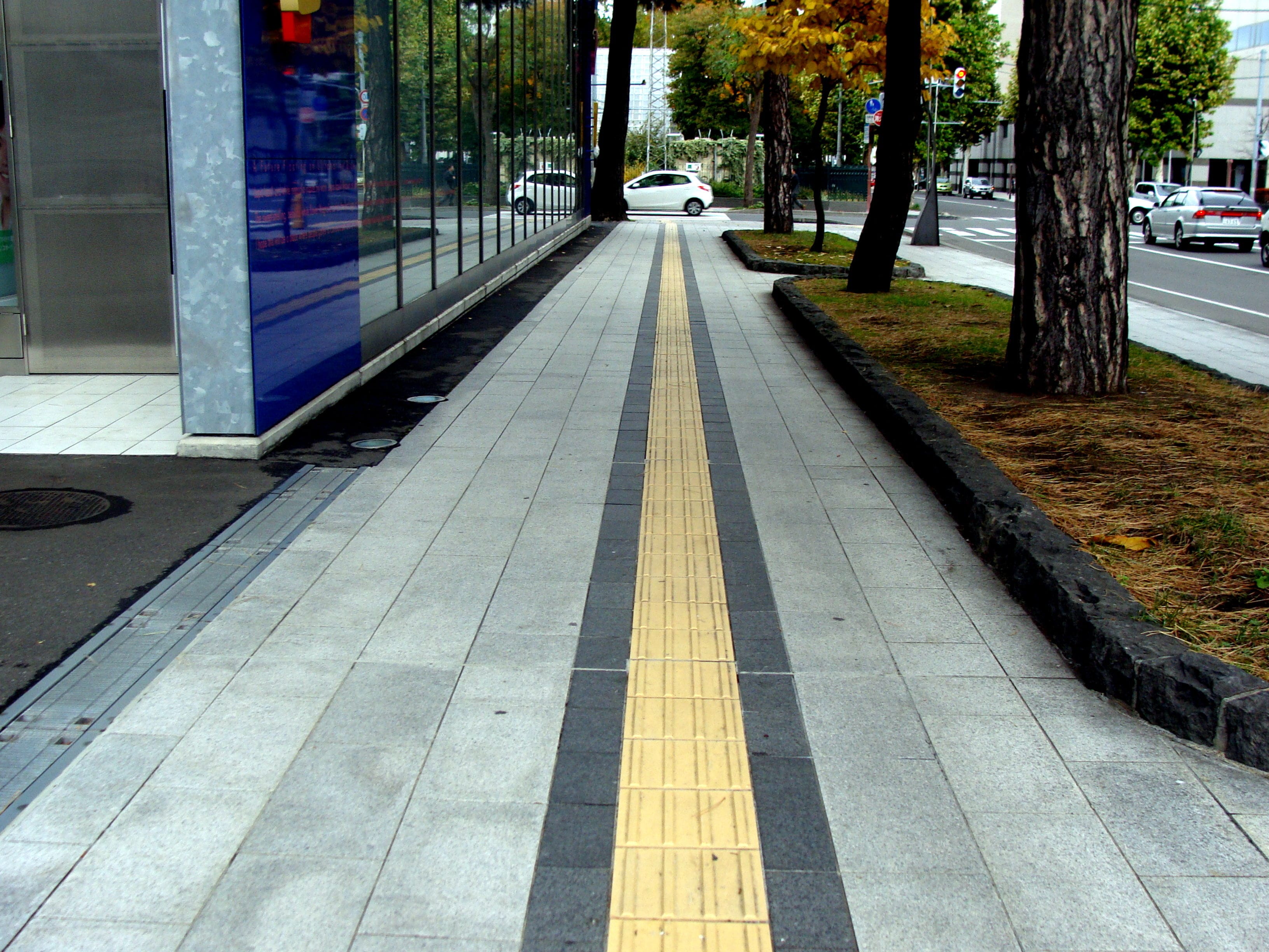
Use textures as wayfinding cues at crosswalks, intersections, and transitional spaces. The universal design for crosswalk pavement is a “blistered” texture, now required by the ADA, so use this at crosswalks — but only at crosswalks and not at other spaces. Know the varying patterns that signify other intersections or exchanges (for example, offset dots to indicate a train platform or other ledge, or stripes that run across a path to signal a tripping hazard). These can help ensure that blind individuals know a change is coming.
Consider tactile ground surface indicators. These yellow rubber strips are becoming popular in many Asian countries, but they can provide everyone with a visual and tactile indicator of where it’s safe to walk. The lines indicate the direction of traffic and bumps indicate when the individual should stop, such as when the path veers in two directions at intersections and crosswalks.


Add railings to mark walking paths. Blind individuals can run their hands along a railing and use it as a guide to avoid stepping off the walkway. This can be particularly helpful when they are navigating walkways near busy streets or bike paths.
Avoid features that could mislead someone with low vision. People with low vision expect blistered sidewalks at crosswalks or contrasting colors to indicate walkways. Avoid adding these features where they are not intended; doing so will create confusion.
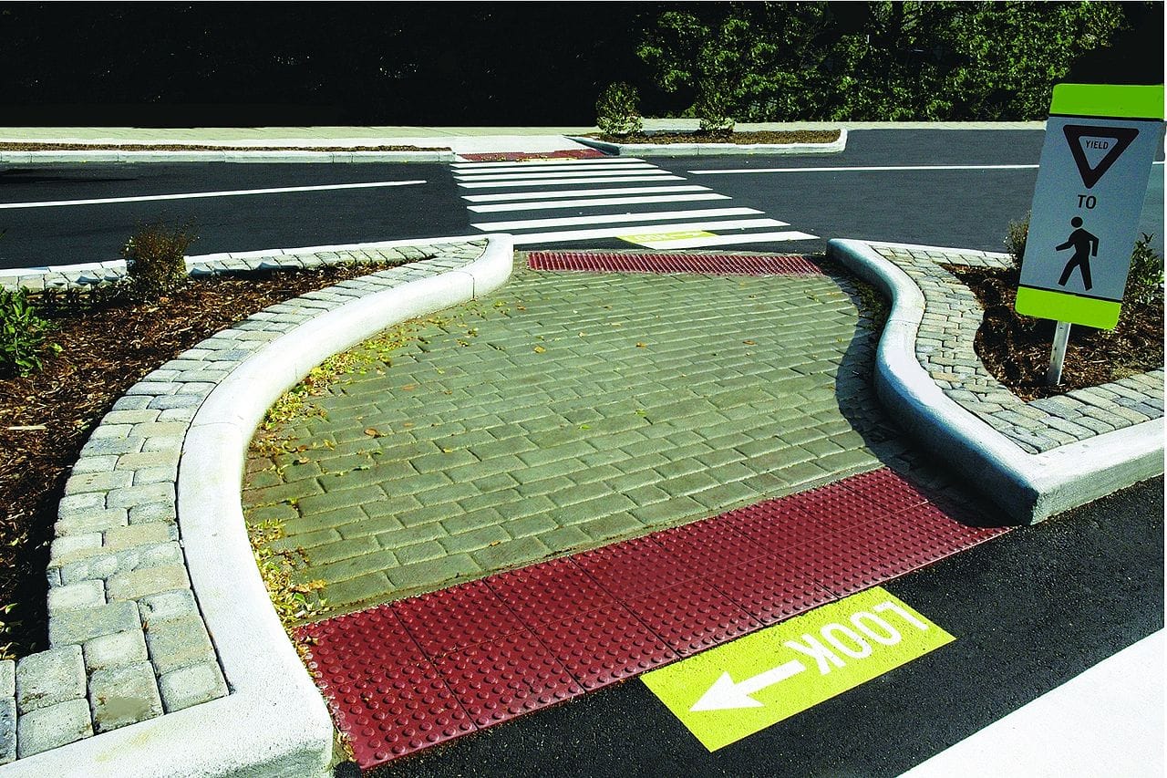
Avoid skewed crosswalks. Blind individuals are taught to enter a crosswalk and walk straight ahead. A crosswalk that is skewed — sloped in two different directions to walk that do not point straight toward the curb — can confuse and potentially harm someone with vision loss. Instead of walking within the crosswalk, the individual may walk directly into the intersection diagonal from the crosswalk. (image)
Keep trees and plants out of pathways. Trees that hang over a walkway may be beautiful, but people with vision concerns may not see hanging limbs or tree trunks easily. Make sure these are kept off of the walkway and do not hang down low enough to hit someone in the head. If you do add trees along a walkway, make sure they’re marked well, using mulch, contrasting colored fencing, or differing textures so people with vision concerns who walk the path do not bump into the trunks.
Create a clear barrier around a bed of trees along the walking path. The change in texture between the pavement and the bedding around a tree trunk can be hazardous to someone who does not see it. Using raised curbs and contrasting colors can make this change clearer to someone navigating the space with a vision impairment. (image)
Utilize natural guidance lines. Drainage channels, contrasting pavement, tactile contrasts, grass edging, and curbs can all help people with vision concerns know where the edge of the walkway is. The key to making these work well is ensuring that they’re continuous, clearly marked themselves, and free of obstruction.
Add curb cuts near intersections. Curb cuts are dips in the sidewalk that eliminate a curb ledge at intersections, making it easier for wheeled vehicles and people with disabilities to mount the curb. When combined with the textured surfaces that indicate a crosswalk, these can make navigating the crosswalk much easier for someone with vision concerns.
Tips for Indoor Walkways

The need to help individuals with low vision through improved walkways does not stop indoors. Here are some tips to make indoor walkways more easily navigable by those with vision concerns.
Change flooring texture to indicate doorways or openings to seating areas. If a walkway is made of tile, for instance, and you have a seating area off of the walkway, consider covering the floor of the seating area with wood or carpet. This will allow someone walking with a cane to determine where to go to have a seat. If different flooring types are not possible for your design, then at least consider a different tile pattern at doorways or other boundary markers.
Add a commercial rug at doorway entrances. If installing different flooring is impractical, another possibility is to invest in some textured rugs that can be placed at doorways and building and room entrances, so individuals with vision impairment know when they’re approaching a doorway. Be sure the pile of the rug isn’t high enough to create a tripping hazard.
Use color contrast on the flooring to help with wayfinding. Darker tiles that point the path down the main walkway, especially when combined with alternate tile patterns, can help people with vision impairment orient themselves as they move toward their destinations.
Keep route guidance as straight as possible. Straight-line pathways and clear, sharp corners can help people navigate the route inside your space more easily.
Avoid contrasting patterns of dark and light floor tiles. To someone with low vision, a “checkerboard” or similar pattern can look like changes in the height of the floor, which is difficult to navigate. Use contrasting colors only for wayfinding.
For more information about how to design walkways that help people with vision concerns navigate more easily, visit:
- National Institutes of Health: Outdoor Difficulties Experienced by a Group of Visually Impaired Iranian People
- University of Maine: Indoor Airport Wayfinding for Blind and Visually Impaired Travelers
- SEGD: Wayfinding for the Visually Impaired
- Cool Blind Tech: Bumps in the Sidewalk Help the Blind and Visually Impaired Navigate
- Accessible Pedestrian Signals: Understanding How Blind Pedestrians Cross at Signalized Intersections
- Mobility Research: Tactile Ground Surface Indicators

Extra Considerations for People Using Guide Dogs or Canes
When designing spaces with the needs of the visually impaired in mind, make sure you also consider the needs of people who walk using the assistance of a guide dog or a long cane. Both of these can be liberating options for people with vision concerns, but only if the spaces they use are also accommodating. These tips can help.
Understand the challenges faced by those using canes or guide dogs in shared spaces. Sharing a space with pedestrians, bikes, and cars can make using mobility aids more difficult. For example, because many visually impaired pedestrians cannot make eye contact with someone, they may not be able at an intersection to read subtle clues that a cyclist intends to proceed first, which could lead to an accident.
Install dedicated pedestrian-only walkways. Creating spaces solely for the use of pedestrians, and additional, separate spaces for the use of cyclists, can help eliminate crashes and similar problems.
Place street furniture off of the walking path. A park bench in the middle of a walking path can be a hazard for someone using a cane to navigate the space. Move the furniture, garbage cans, and other obstacles to the side of the path.
Remove obstacles that could allow a cane to get stuck. Canes are fairly narrow, and divots or cracks in the walkway, or even the seam between two sidewalk panels, can allow them to get stuck. Remove these hazards from public paths.
Remove obstacles that complicate the workload for guide dogs. Though guide dogs are well trained to ignore and avoid most distractions, their job should not be made harder by the design of spaces they travel through. Make dogs’ working environments minimally complex to help them guide their handlers properly. For example, avoiding stationary and moving obstacles at the same time, as are often found in shared spaces, can be too much for some guide dogs to handle. Also, cyclists and motorists that travel close to the walking path can increase the risk of spooking a guide dog, presenting a danger for the dog and the person it’s guiding.
Understand that guide dogs do not react to color or texture contrasts. Instead, guide dogs are trained to react to obstacles like curbs and barriers. In other words, they do react to physical boundaries, so adjust building and outdoor space design accordingly.
For more information about the challenges faced by people using canes or working with guide dogs, visit:
- World Blind Union: White Cane Information
- Spokane Regional Transportation Council: White Cane Walk Shows How Transportation Can Be a Challenge to the Sight Impaired
- Life of a Blind Girl: The Cane Debate
- Health 24: Guide Dogs Face New Challenges
- Guide Dog Foundation: Etiquette for Guide and Service Dogs
Special Considerations: Individuals with Colorblindness, Reduced Depth Perception, or Reduced Peripheral Field
A few categories of vision impairment that are often overlooked are colorblindness, compromised depth perception, or a reduced peripheral field, also known as “tunnel vision.” Each type of visual impairment carries its own specific problems in navigating public spaces, and each can be accommodated by different design elements.
Colorblindness involves an individual’s inability to see colors or contrasts properly. This problem affects around 4.5% of the population. Colorblind individuals can see clearly but cannot differentiate between certain colors. Here are some considerations to keep in mind when designing spaces that apply to colorblind people:
Understand the different types of colorblindness. The most common type of colorblindness is red/green colorblindness, which involves the inability to differentiate between different hues of red and green. Some people suffer from blue/yellow colorblindness, which makes blues and yellows indistinguishable, while a minority of people with colorblindness will be unable to distinguish colors at all.
Keep signage universal in shape and orientation to eliminate confusion. Because many signs use red and green to indicate “stop” and “go” signals, people with colorblindness sometimes struggle. To avoid confusion, keep the orientation of the signage universal. For example, the red “stop” signal should always be at the top of a traffic signal, with the green “go” at the bottom.
Avoid using red and green or blue and yellow together if a sign or signal requires color differentiation. You can use these colors as desired for aesthetics, but if the people in your facility or using your outdoor space must be able to distinguish the color differences, avoid using those colors together.
Use prominent contrasts. Contrast, once again, is important when designing for people with colorblindness as their form of visual limitation. The greater the visual contrast between two items, the better someone with colorblindness will be able to see them, even if the colors appear similar to the individual.
Never use color alone to indicate the meaning of a sign. Also use text or symbols to ensure someone with colorblindness can understand the meaning.
Use patterns in addition to colors to create greater contrast. This can make it easier for colorblind individuals to differentiate between different parts of a sign, markings on the floor, and other important designations in your space, even if they cannot distinguish the colors well.
Because they find it difficult to judge distances, people with compromised depth perception have trouble perceiving where surfaces change levels, whether on walkway floors or at countertop levels. This condition happens most frequently when one eye is damaged or lost. The brain can adjust to improve depth perception through one eye, but these individuals may still find level changes challenging to negotiate.
Clearly indicate areas where walking or counter surfaces change levels. Help them see these spots by implementing brighter illumination and designated markings in prominently contrasting colors.
A reduced visual field means that a person has trouble seeing at the periphery, or outer edges, of their field of vision. It can also mean that the person’s two eyes don’t function as a team, sending conflicting images to the brain and resulting in blurry, overlapping, or indistinct images. This can make it difficult for someone with reduced peripheral vision to anticipate obstacles or moving hazards.
Expand bottlenecks, mark and light pathways, and duplicate signage. People with reduced peripheral vision may have trouble navigating narrow doorways and walkways. Expand any doorways where it’s possible to ease the traffic flow, avoiding potential bottlenecks. Make sure pathways and interchanges are adequately lit, glare is controlled, and large-lettered signage is duplicated in several prominent spots to accommodate these needs. Designated wayfinding pathways also help people with a reduced peripheral field find their destinations.
For more information about how to design spaces for people with colorblindness, compromised depth perception, or a reduced visual field, consider these resources:
- Accessibility Basics: Designing for Visual Impairment
- Usabilla: How to Design for Color Blindness
- Therapeutic Landscapes Network: Designing a Landscape for Color Blind People
- The Academy of Neuroscience for Architecture: Lessons Learned from Oliver Sacks – colorblindness and Wayfinding
- Natl. Eye Institute: Five Innovations Harness New Technologies for People with Visual Impairment, Blindness
Conclusion
When designing spaces, you must consider the needs of all the people who will use them, including those with vision difficulties. It’s not always easy to design for the visually impaired, but it’s crucial to maintaining compliance with ADA regulations — and to ensuring that all people who visit your space are able to use it well.
By gaining an understanding of the challenges faced by those with vision impairment, and implementing the right designs into your buildings and outdoor spaces to accommodate them, you can create spaces that accommodate everyone who needs to use them.
Resources
For more information about designing outdoor spaces to aid the navigation of individuals with vision impairments, visit:
- World Blind Union: How Shared Spaces Affect the Safe Transit of Blind and Partially Sighted Persons
- British Journal of Visual Impairment: Accessibility of Shared Space for Those Who Are Visually Impaired
- Scottish Sensory Centre: Accessing Outdoor Environments for Visually Impaired Children
- TeachingVisuallyImpaired.com: Playground Adaptations for Students with Visual Impairments
- National Federation of the Blind: Audible Street Signals Are Barriers to the Blind
- We Capable: Meanings of Tactile Paving: A Blessing for Persons with Visual Impairment
For more help designing indoor spaces that consider the needs of blind people or those with low vision, visit:
- ThoughtCo.: Designing for the Blind
- AxisArch: Design for the Blind: Architecture for the Visually Impaired
- The Economist: The Rise of Buildings for the Deaf and Blind
- Smithsonian: Smithsonian Guidelines for Accessible Exhibition Design
- University of Maine: Indoor Airport Wayfinding for Blind and Visually Impaired Travelers
- National Federation for the Blind: Moving the Challenge Indoors
For more information about how to design walkways that help people with vision concerns navigate more easily, visit:
- National Institutes of Health: Outdoor Difficulties Experienced by a Group of Visually Impaired Iranian People
- University of Maine: Indoor Airport Wayfinding for Blind and Visually Impaired Travelers
- SEGD: Wayfinding for the Visually Impaired
- Cool Blind Tech: Bumps in the Sidewalk Help the Blind and Visually Impaired Navigate
- Accessible Pedestrian Signals: Understanding How Blind Pedestrians Cross at Signalized Intersections
- Mobility Research: Tactile Ground Surface Indicators
For more information about the challenges faced by people using canes or working with guide dogs, visit:
- World Blind Union: White Cane Information
- Spokane Regional Transportation Council: White Cane Walk Shows How Transportation Can Be a Challenge to the Sight Impaired
- Life of a Blind Girl: The Cane Debate
- Irish Guide Dogs for the Blind: Making Sense of Shared Space for the Blind and Vision Impaired
- Health 24: Guide Dogs Face New Challenges
- Guide Dog Foundation: Etiquette for Guide and Service Dogs
For more information about how to design spaces for people with colorblindness, compromised depth perception, or a reduced visual field, consider these resources:
- Accessibility Basics: Designing for Visual Impairment
- Usabilla: How to Design for Color Blindness
- Therapeutic Landscapes Network: Designing a Landscape for Color Blind People
- The Academy of Neuroscience for Architecture: Lessons Learned from Oliver Sacks – colorblindness and Wayfinding
- Natl. Eye Institute: Five Innovations Harness New Technologies for People with Visual Impairment, Blindness